


Three compelling ways to visualize how much sugar is in soda
by: Heather Gehlert
posted on Tuesday, April 26, 2016
Soda taxes are in the news now more than ever. Momentum began with early attempts from Richmond and El Monte, California, to tax sugary drinks, picked up steam when Berkeley delivered a crushing blow to the beverage industry with its 2014 approval of a tax, and has been catapulted into the mainstream media spotlight with Philadelphia’s recent soda tax proposal — and the controversy surrounding it.
With that news coverage, some of the soda industry’s favorite anti-tax talking points are being rehashed on a national stage. Among them is the bogus claim that regulating sugary drinks would hurt low-income families. As advocates work to combat industry-perpetuated “regressivity” arguments and steer the conversation back toward health, it’s important to remember that for people to fully grasp what’s really regressive here — a heavily marketed, disease-promoting product — they must also understand just how harmful sugary drinks are.
If Bernie Sanders’ recent statements against Philadelphia Mayor Jim Kenney’s proposed soda tax are any indication, public health advocates still have more work to do in educating people. Last week, after presidential rival Hillary Clinton said that she supported Kenney’s proposal, Sanders spoke out against it and called it a tax on the poor.
Mayor Kenney promptly issued a response to reframe the conversation and show that the real issue at hand is the soda industry and its aggressive target marketing to low-income communities and communities of color. Public health advocates were quick to amplify Kenney’s message, but instead of reconsidering the issue, Sanders doubled down on his argument by penning this op-ed for Philadelphia Magazine.
The Democratic senator’s message reveals an important lesson: Changing deeply embedded social norms takes time and requires repeated reframing of beverage industry talking points. Sanders is widely considered a progressive politician, so if he does not see soda as a public health and equity issue, it’s not a stretch to think that other elected officials may have a similar blind spot.
To that end, incorporating strong visuals and social math into messages can help advocates illustrate soda’s health harms, specifically by showing exactly how much sugar it contains. BMSG has compiled several such examples, culled from the tireless work of advocates across the country who are exposing soda for the aggressively marketed, diabetes-fueling, teeth-rotting sugar water that it really is.
In no particular order, below are three compelling ways to visualize how much sugar is in soda and other sweetened drinks. Although these campaigns are aimed at educating individuals, they can also help educate policymakers, garner media attention and, ultimately, boost support for policy change.
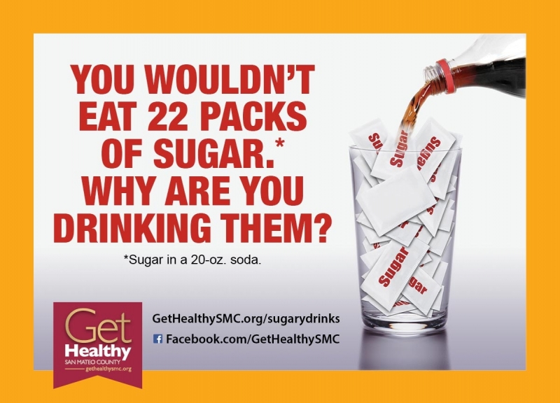
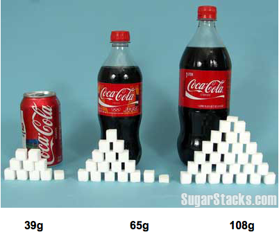
1) Photograph sugary drinks next to their sugar equivalent in cubes, teaspoons, or other easy-to-understand metrics.
Get Healthy San Mateo County and sugarstacks.com offer great examples of this tactic. Although beverage labels list the amount of sugar a product contains in grams, these visuals help make those numbers more meaningful.
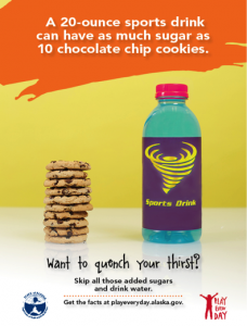
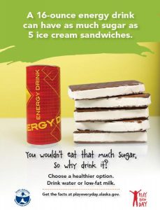
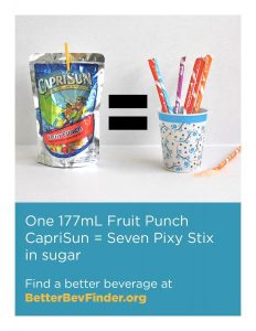
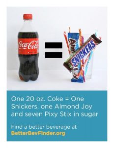
2) Juxtapose beverages like soda, sports drinks, energy drinks and juice against candy and desserts that contain the same amount of sugar.
These fantastic examples come from the Alaska Department of Health and Social Services and Sugar Free Kids Maryland.
3) Bring visuals to life with video.
In an effort to show that juice drinks are not as healthy as people think, Delta Dental compares apple juice and orange juice to liquefied donuts and cupcakes. The 15-second clips are effective not only because they are memorable but also because they are short and easy to share.